
How to Make Social Media Graphics That Actually Look Good (Even If You’re Using Canva)
Let’s be honest—social media can feel like a never-ending scroll of mismatched fonts, random stock photos, and “meh” templates. And while you could just slap your logo on a stock photo and call it a day… your audience deserves better. And frankly, so does your brand.
But here’s the truth: you don’t need to be a designer or spend hours learning design software to make social graphics that look polished and on-brand. Tools like Canva make it so much easier to start with a strong base—as long as you know how to adapt a template to your brand.
This guide will walk you through how to find the right starting point, make it yours, and create graphics that actually do your business justice.
1. Start with Your Brand (Then Choose the Right Template)
Templates are a great shortcut—once you know your brand. Before you dive into Canva’s massive template library, make sure you’re clear on the essentials:
What are your brand fonts and colors?
What kind of mood or vibe should your graphics give off?
What do you want your audience to feel when they see your content?
Branded graphics build recognition. That means using consistent fonts, colors, imagery, and tone across every post—so even a quick scroll tells your audience, “This is you.”
💡 Canva Tip: Use the Brand Kit to upload your logo, colors, and fonts. Once it’s set up, you can instantly apply your brand style to any design—no more digging for hex codes or trying to remember which font size you used last time.
Now that you’ve got your brand set up, then it’s time to explore Canva templates. But don’t just pick one based on looks—search by subject matter instead (like “new product,” “event reminder,” or “testimonial”).
🔍 Smart Search Tip: Look for templates that are structurally close to what you need. You won’t find a perfect match—but you don’t need one. Just find a solid layout, then customize it with your brand colors, fonts, and images.
📌 Pro Tip: Once you’ve customized a template to fit your brand, save it as a reusable design. Build a small collection of go-to templates for things like announcements, promos, or quotes—so you’re never starting from scratch again.
Before you touch a template, this is what you need: a clear brand identity. Heart & Cone’s brand board shows the logo variations, color palette, and font pairings that will guide every graphic we create.

Here’s the Canva template we started with—close in mood and layout, but not quite on-brand yet. The retro vibe works for Heart & Cone, but the fonts and colors still need to be customized.

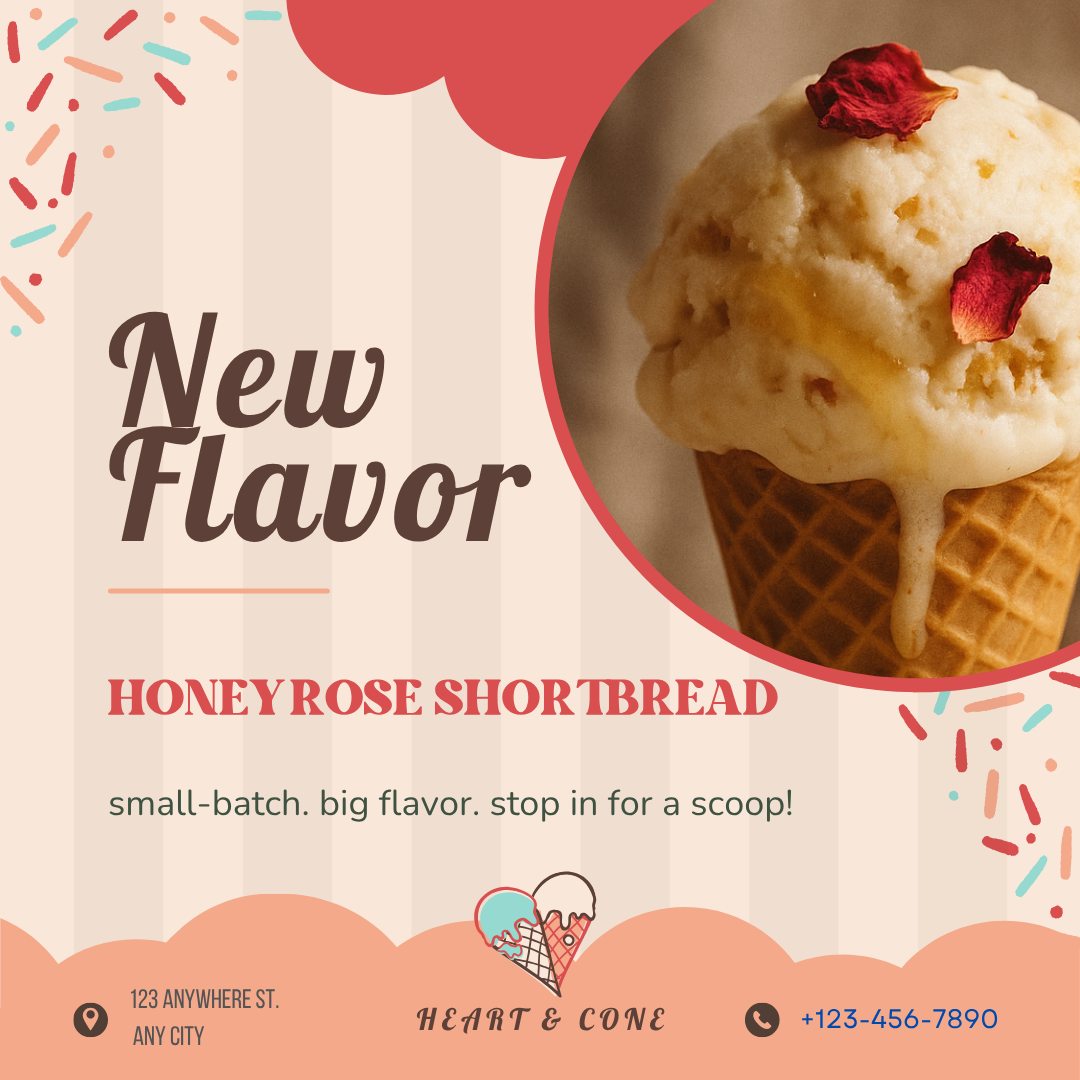
Here’s that same template, now fully Heart & Cone–ified. Transformed with the brand’s fonts, colors, tone, and a cozy on-brand photo. Now it looks looks intentional, cohesive, and instantly recognizable.
2. Use Fewer Fonts (And Use Them Well)
Nothing screams “DIY gone wrong” like a graphic with five different fonts fighting for attention.
Stick to 1–2 fonts per graphic:
One for headlines or bold statements
One for supporting text or captions
Make sure they’re legible (especially on mobile), and always check for contrast—light text on a light background won’t cut it.
Need help picking fonts for you brand, check out this blog post.
Here’s what not to do: mixing too many fonts and colors makes your graphic feel chaotic and off-brand. Instead, keep it clean and intentional.

This is how it’s done: one font for headlines, one for body text. Simple, readable, and easy to apply across all your graphics.
3. Choose On-Brand Images (or No Image at All)
Stock photos can totally work—if they match your brand. The key is to choose visuals that feel like an extension of your brand’s personality. Look for images that:
Match your color palette (or can be edited to fit it)
Feel natural and aligned with your brand voice
Don’t scream “generic corporate filler”
Think: a cozy mug on linen for a slow-living brand—not a stock photo of a high-five in a fluorescent office.
📸 Using Canva or AI for Images?
Canva has a built-in image library that’s full of high-quality stock photos. But don’t just grab the first one that looks nice—make sure it fits your brand’s tone and mood. If nothing feels quite right, you can:
Upload your own branded photos
Use AI tools (like DALL·E) to generate custom images that match your vibe
Stick to clean, text-based designs with branded elements like icons, shapes, or background textures
✨ AI Shortcut: Need something oddly specific—like a vintage gelato cone on a linen napkin? Describe it in detail to a tool like DALL·E and let it generate something unique and on-brand without hours of stock photo scrolling.
🧾 When to Skip the Photo Altogether
You don’t always need an image. In fact, bold, text-based graphics often perform better—especially for quotes, list-style posts, or reminders. Just keep it clean, readable, and on-brand with your fonts, colors, and layout style.

This image was created with AI to match Heart & Cone’s brand vibe: warm, handmade, a little nostalgic. The soft lighting, linen background, and vintage-style cone all feel perfectly aligned.

Swapping in the right photo makes all the difference. With this warm, on-brand image in place, the design feels more cohesive and intentional.
4. Prioritize Hierarchy and Spacing
Hierarchy is how your viewer knows what to read first. Use:
Size
Weight (bold vs regular)
Color
To guide the eye from headline → supporting text → CTA (call to action).
Also: white space is your friend. Don’t crowd every inch with text and visuals. Give your content room to breathe.

This design lacks visual flow. Same-size fonts and cramped spacing make it hard to scan and even harder to remember.

With a clear size difference between headline and body copy, this graphic is easier to scan and more visually engaging.

This layout uses white space to its advantage—giving each element room to stand out and the entire design space to breathe.
5. Use the Right Size for Each Platform
Don’t post a stretched-out Instagram Story on your Facebook feed. Different platforms = different dimensions.
Here are a few quick cheat sizes:
Instagram Feed: 1080 x 1350 px
Instagram Stories / Reels: 1080 x 1920 px
Facebook / LinkedIn Posts: 1200 x 630 px
Pinterest Pins: 1000 x 1500 px
Design with the final platform in mind, so nothing gets cut off or pixelated.
Canva Shortcut: Not sure what size to use? Canva has pre-sized templates for every platform—Instagram, Pinterest, LinkedIn, Stories, Reels, and more. Just select the right format when you start a design, and Canva will set the dimensions for you automatically. No need to memorize pixels or Google aspect ratios!

Square graphics work—but they don’t maximize visual impact. On Instagram, portrait-oriented posts take up more vertical space and are more likely to stop the scroll.

Same design, different canvas. This version was resized using Canva’s preset Instagram Post format, making it perfectly scroll- and swipe-friendly.
6. Test and Tweak What Works
The prettiest graphic in the world doesn’t matter if no one engages with it.
Try a few variations, mix up formats (carousel, quote, infographic), and keep an eye on what gets saves, shares, or clicks.
Your best-performing graphics can teach you what your audience loves. Use that data to design smarter—not harder.
The Takeaway
Designing scroll-stopping social media graphics isn’t about being a professional designer. It’s about consistency, clarity, and confidence in your brand.
Stick to a cohesive look, keep it simple, and always lead with your message—not just the visuals.
Need Help Creating Graphics that Match Your Brand?
If your social media feels like a style mismatch or a template graveyard,
I can help you build branded templates that actually look good—and save you time in the process.