How to Choose a Brand Color Palette That Actually Works
Ever spent hours scrolling Pinterest for the perfect brand colors… only to still feel unsure?
You’re not alone. Choosing colors for your brand can feel like a huge decision. Will this make me look professional enough? Too trendy? Too bland? What if I just really like sage green… but it doesn't mean anything?
Here’s the truth: your brand colors are more than just pretty visuals — they help create recognition, build trust, and evoke the exact vibe you want your dream clients to feel.
In this post, I’ll walk you through a simple, no-stress process I use as a brand designer to help clients choose color palettes that actually work — even if you don’t consider yourself a “visual person.”
Step 1: Define Your Brand Personality
Before you pick a single color, you need to understand your brand’s vibe. Colors aren’t just decoration — they communicate emotion and personality.
Ask yourself:
What 3 words describe the way I want my brand to feel?
Here are some words to spark ideas:
Bold
Calm
Whimsical
Luxe
Friendly
Grounded
Playful
Minimal
Edgy
Once you define your brand personality, your color choices will have direction and feel more intentional — instead of just based on your favorite shade of blue.
Step 2: Understand Basic Color Psychology
Colors send signals — and each one evokes a different feeling. Here’s a quick cheat sheet of what common colors tend to communicate:
Black- Mystery, elegance, modern, bold
White- Clean, fresh, minimal, purity
Yellow- Optimistic, youthful, clarity, energy
Orange- Confident, playful, enthusiastic
Pink- Playful, charming, feminine, delicate
Red- Strength, passionate, excitement, warmth
Purple- Luxe, creative, spiritual, intuitive
Blue- Trust, professionalism, calm, stability
Green- Nature, growth, wellness, balance
Brown- Grounded, reliable, humble, organic
You don’t have to follow these meanings rigidly, but being aware of them helps you make more intentional, aligned choices.
Step 3: Collect Visual Inspiration
Once you know how you want your brand to feel and what your colors should communicate, it’s time to look for visual inspiration — this time with direction.
Instead of endlessly scrolling Pinterest, try this:
Create a moodboard in Canva or Pinterest
Pin/save images, textures, or colors that match your brand’s personality
Pay attention to what themes and tones keep showing up
This step turns your vibe into something visual — and keeps you from picking colors that look nice but don’t reflect your brand.
Step 4: Build a Balanced Palette
Now you’re ready to build your actual palette! Use tools like Co0lors or Canva’s palette generator to pull hex codes from your moodboard.
Here’s a simple palette structure I recommend:
1-3 Primary Colors – your main brand colors (these are the color you will use the most)
1–3 Accent Colors – bold or contrasting shades for buttons, highlights, or section breaks
1 Light Neutral Color – for backgrounds, whitespace, or soft elements
1 Dark Neutral Color – for contrast in text, headers, or overlays
Quick Examples:
Soft & Minimal Color Palette:
Bold & Vibrant Color Palette:
Ask yourself:
Do these colors reflect my brand personality — especially when used together?
Step 5: Test Contrast & Refine
Design is about more than aesthetics — it also needs to be accessible. That means checking for contrast between your colors.
Use these tools:
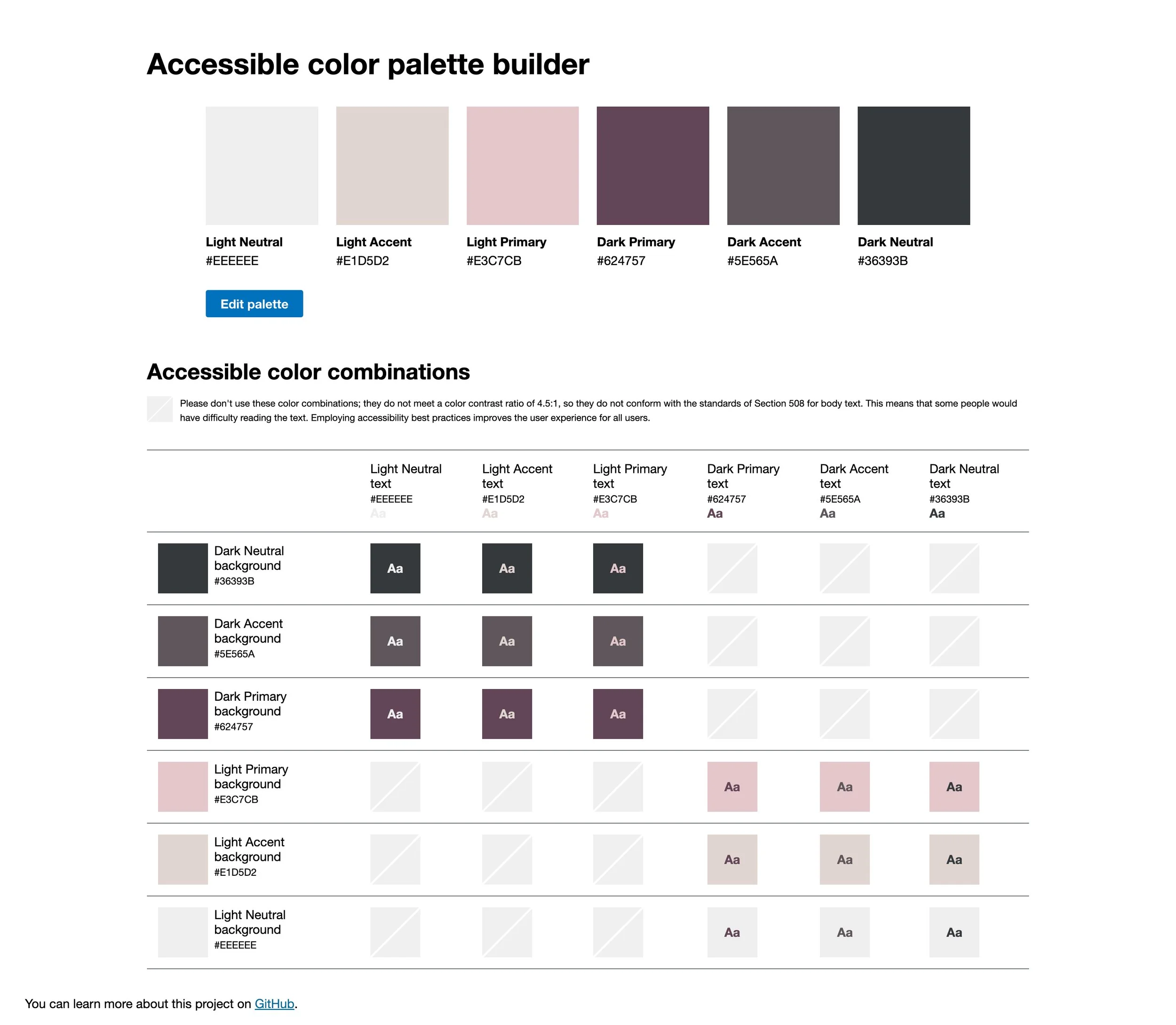
Toolness Accesible Color Matrix – See which color combinations pass accessibility standards
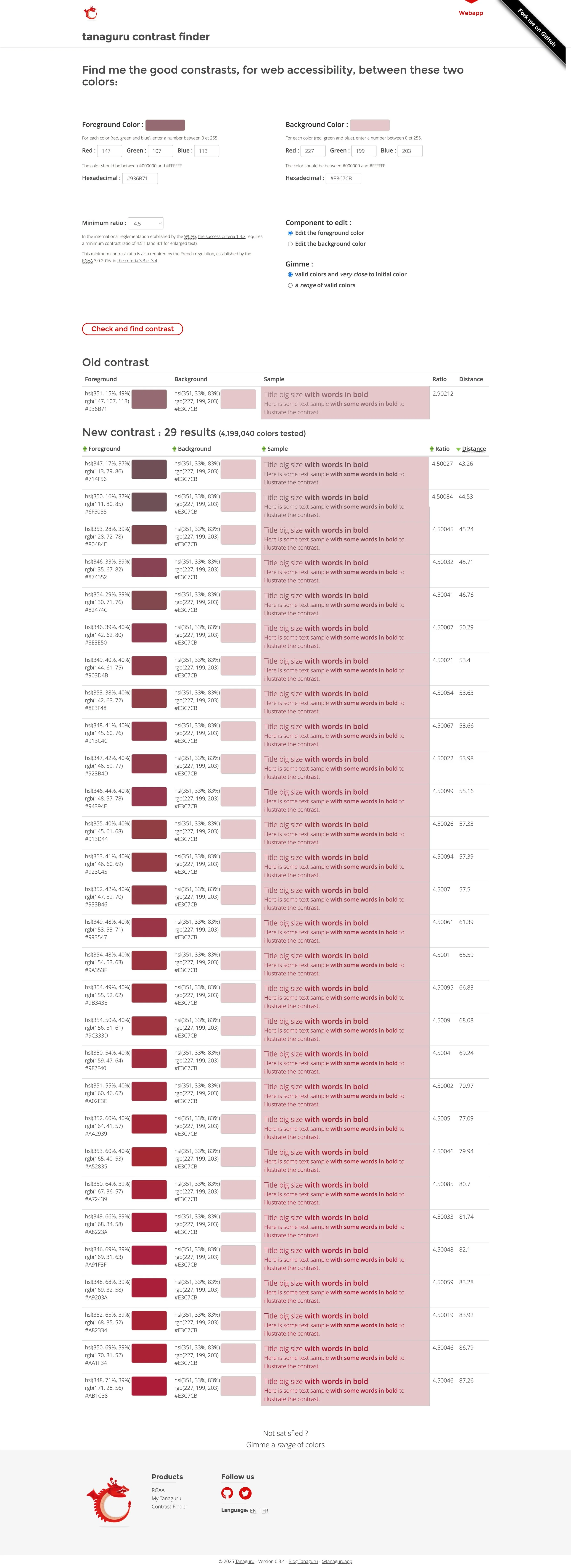
Tanaguru Contrast Finder – Suggests high-contrast alternatives if yours don’t pass
Coolors – Adjust shades slightly to improve contrast
Aim for at least half of your color pairs to pass contrast checks, especially for text on backgrounds.
Step 6: Finalize & Use your NEw Color Palette
Use a tool like Colormind.io to preview your palette on a mockup website layout — so you can see it in context, not just as swatches.
Once you’re happy, save your final palette in a simple brand guide, or create a Canva template with your color codes built in.
Reminder: Done is better than perfect. Your palette should feel like you, not like whatever’s trending this week.
Ways to Use Your Color Palette:
Website backgrounds + text styles
Social media templates
Buttons + call-to-actions
Brand photography styling
Client presentations or PDFs
Packaging and printed materials
🛠 Helpful Tools Recap:
Coolors.co – to build and browse palettes
Pinterest and Canva – collect visual inspiration and create a moodboard
Toolness – check color contrast at a glance
Tanaguru – find better contrast pairs
Colormind.io – see your palette in a website mockup
Bonus:
Big Color Palette – generate themed palettes with up to 10 colors (less user-friendly, but still useful)
Still feeling stuck?
I’d love to help you build a brand that reflects your personality, your values, and your vibe.
Let’s create something beautiful together!


